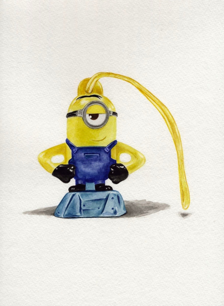
This is a 9″x13″ watercolor of a little minion toy from a cereal box. It’s a free hand. I definitely spent more time because this assignment required more attention to detail and I wanted to accurately portray the little guy. I’d say I put at least 5 hours into this, maybe more. I’m really pleased with how it turned out (my parents are too—they want it for themselves).
Monthly Archives: September 2015
Watercolor Selfie
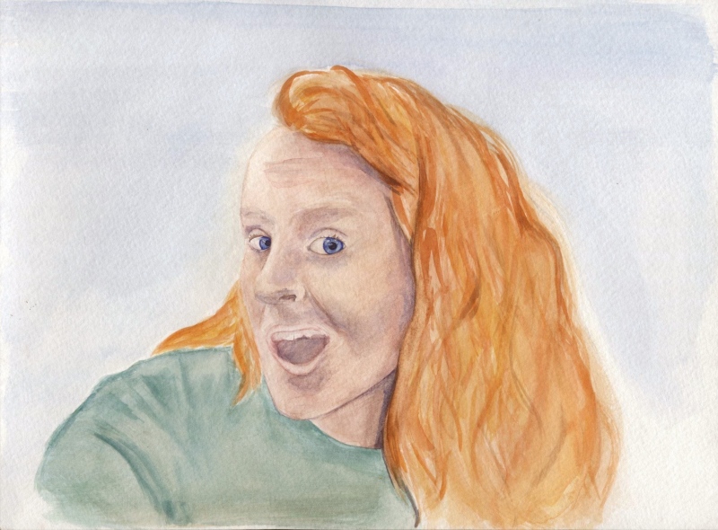
This illustration needs some linework to add contrast, but I don’t think I’ll be much happier with the result. When I put down the base colors I was off to a good start, but I think I took a wrong turn early on when adding the purple shadows. I did try lifting the color and adding more pink skin tones, but I added too much. I am happy with how the eyes turned out; I put more effort in conveying the glassy sort of detail and contrast. I may try to lift some more color from the fast and go in with some linework for the contrast that this whole piece needs.
Architecture/Landscape Watercolor
I dragged my feet with this assignment. I wasn’t thrilled about doing more architecture/landscapes, but I was surprised at how pleased I was with the results. The two that were most annoying were the tower and the church, but the other ones I enjoyed because of the color variation. Between drawing, painting, and adding line work, I probably spent at least two hours per piece. I began the semester keeping track of my time well, but then it got pushed to the back burner. I was more focused on getting the work done and in the way I wanted that I forgot to keep track of the time, but I see that as a good thing. I like getting lost in work. Three of these images ended up in my midterm portfolio.
Watercolor Birds
I am less pleased with how these two watercolor birds turned out; with the previous bird illustration I used gouache, so I think I used the color more heavily because it was from tubes whereas the watercolor was a palette. The color combinations of these two birds are less interesting to me, maybe because I didn’t execute them as successfully. I know I need to re-familiarize myself with blending watercolor and conveying more energy and life to subject matter that is life (portraits, animals, etc.). The branch on the right needs more detail and the background looks odd. I like the effect of the slightly dry-brush technique, but I don’t think it worked well here. These both were kind of disappointing. The one on the left gave me trouble because I tried too hard to get the color from the original photo—I should’ve embraced a different approach sooner. I spent 2-3 hours for each illustration, but if I were to redo them I would be able to work faster and be happier with the end result.
Watercolor Bird #1
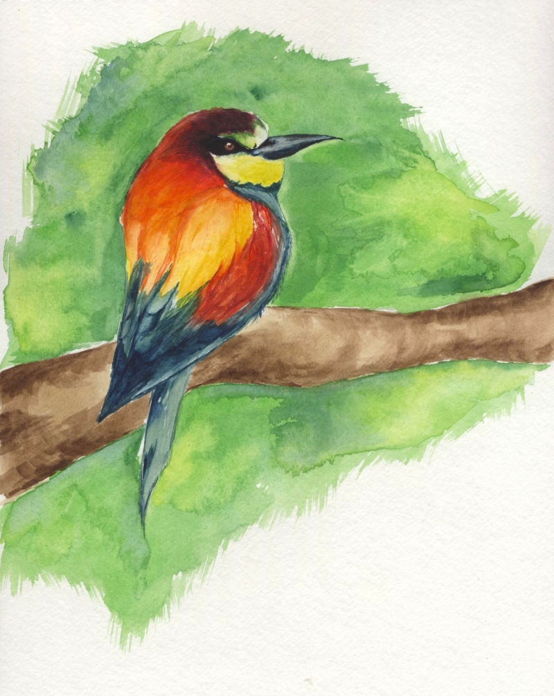
This bird was created in class after Rusty gave the demonstration for watercolor/birds. I’m pretty sure I used gouache instead of watercolor, but that’s okay. I don’t remember if I finished it in class or if I had to touch up some spots afterward, but I want to say that I finished it in class. Eh I just don’t remember. Maybe 2 hours. Yeah. This is my favorite out of the three birds we had to do.
Line Drawings & Watercolor
For this assignment I wish I had chosen a different variety of subjects and spent more time using the watercolor. I think I misinterpreted this assignment, but regardless I think I was in a rut. I struggled to choose subject matter and ultimately was unhappy with what I chose and how I executed all of it. I’m really only okay with the one tissue box. (around 7 hours for it all)
Watercolor Landscapes from Drawings
20 Landscape Line Drawings
I realized I worked more quickly on these landscape drawings because I didn’t enjoy them as much as drawing people or animals. However, there is more freedom in creating landscapes because the expectation for specific results is different; when drawing people or animals, it seems more important to recreate the original subject whereas the landscape can more easily be adjusted or whimsical.


